Quick Guide:
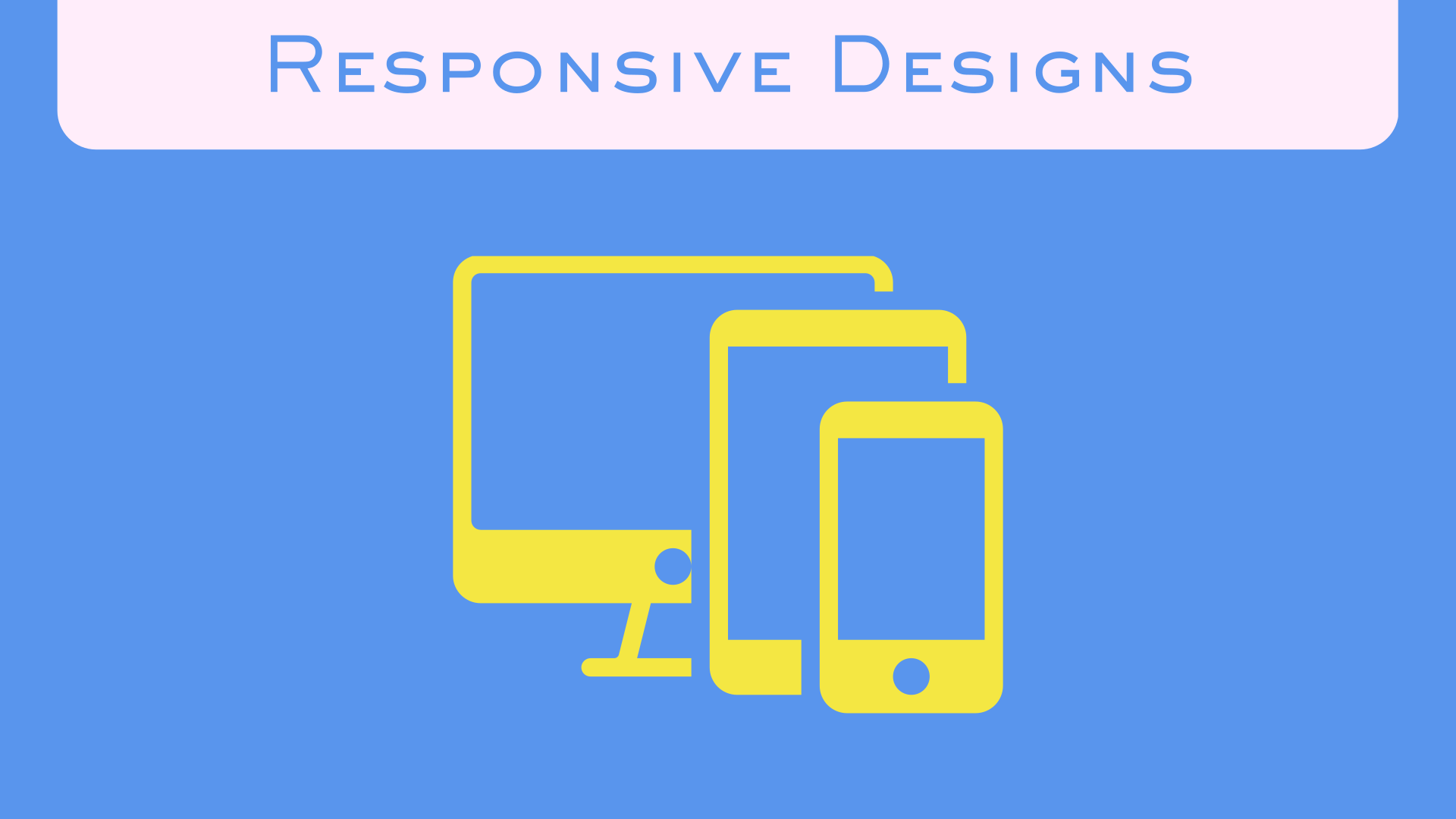
Think of a website like a shirt. One size doesn't fit everyone. A responsive website adjusts to fit phones, tablets, and computers, so every visitor gets a comfortable experience.
"Responsive design" sounds like tech jargon, but it's actually a simple idea: your website should work perfectly whether someone visits on a phone, tablet, or computer. Let's break down exactly what this means for your business.
What is Responsive Design?
Responsive design means your website automatically adjusts to fit whatever screen size your visitor is using. Think of it like water - it takes the shape of whatever container you pour it into.
A responsive website:
- Rearranges content to fit small phone screens
- Enlarges text so it's readable without zooming
- Makes buttons big enough to tap with your finger
- Hides or reorganizes menus for easy navigation
- Loads images at the right size for each device
See It In Action
Open any website on your computer, then open the same site on your phone. If you have to pinch, zoom, or scroll sideways - that site is NOT responsive!
Why It Matters for Your Malaysian Business
Here's the reality: in Malaysia, over 99% of internet users own a smartphone, and a huge share of your traffic is coming from a phone screen. If your website doesn't work well on phones, you're losing customers every single day.
You're Losing Customers
Studies show that 53% of mobile users leave a website if it takes more than 3 seconds to load or is hard to use. That's half your potential customers - gone! They'll simply click back and visit your competitor's site instead.
Google Prefers Mobile-Friendly Websites
Google uses "mobile-first indexing." This fancy term means Google looks at your mobile site FIRST when deciding where to rank you in search results. If your mobile site is terrible, your Google ranking drops. Fewer people find you = less business.
Lost Sales Every Day
Imagine someone on their lunch break searching for your service on their phone. They find your website, but the text is tiny, buttons don't work, and they can't figure out how to contact you. They give up and call your competitor instead. That's real money lost.
Sources: Department of Statistics Malaysia, ICT Use and Access Survey 2025 · Google, Make Your Mobile Pages Load Faster
How to Check if Your Website is Responsive
Don't worry, you don't need to be tech-savvy to test this. Here are three simple ways:
Method 1: The Phone Test
Pull out your phone right now and visit your website. Ask yourself:
- Can I read the text without zooming?
- Can I tap buttons easily with my thumb?
- Does the menu work properly?
- Do I need to scroll sideways? (Bad sign!)
- Does everything load quickly?
Method 2: The Desktop Browser Test
On your computer, open your website in Chrome, Firefox, or Safari. Make your browser window smaller by dragging the edge. Does your website rearrange itself nicely? Or does everything break and look messy?
A Common Story
We've worked with local businesses that had no idea their website was hard to use on mobile - until a customer pointed it out. By then, they'd already been losing sales for months without knowing it.
Common Responsive Design Mistakes
Even websites that try to be responsive often make these mistakes:
Text Too Small
If people need to pinch and zoom to read your content, they'll leave. Text should be at least 16 pixels on mobile.
Buttons Too Close Together
Ever tried to tap a button and accidentally hit the wrong one? Buttons need space. Your finger is not a mouse pointer!
Huge Images That Slow Everything Down
Loading a desktop-sized image on a phone wastes data and time. Good responsive sites use smaller images for mobile.
Complicated Menus
That fancy dropdown menu from your desktop site? It probably doesn't work on mobile. Menus need to be simple and touch-friendly.
Forms That Are Impossible to Fill
Tiny form fields and awkward layouts make people give up before submitting. Your contact form should be easy to complete on a phone.
What Good Responsive Design Looks Like
A truly responsive website should give users a great experience no matter what device they're using. Here's what to look for:
One Column on Mobile
Content stacks vertically instead of squishing side-by-side, making everything easy to read and tap
Big, Tappable Buttons
Easy to hit with your thumb, at least 44x44 pixels - no more accidentally tapping the wrong thing
Readable Text
No zooming needed, proper spacing between lines, comfortable font size for easy reading
Simple Navigation
Usually a "hamburger menu" (☰) that opens when tapped, keeping things clean and organized
Fast Loading
Images optimized for mobile, quick page loads - nobody likes waiting around
Touch-Friendly
Everything works with fingers, not just mouse clicks - designed for real human hands
No Horizontal Scrolling
Everything fits the width of the screen - scroll down, never sideways
Pro Tip
Test your website on actual devices, not just by resizing your browser. Real phones and tablets can behave differently than your computer screen!
Don't Let a Bad Mobile Experience Cost You Customers
Responsive design isn't about being trendy or high-tech. It's about basic respect for your customers. When someone takes the time to visit your website, they deserve a good experience - whether they're on a phone while waiting for the LRT or on a computer at their office desk.
In Malaysia's mobile-first market, a non-responsive website is like having a shop with a broken door. Sure, some determined customers might still find a way in, but most will just walk away and shop somewhere else.
The good news? Making your website responsive is easier than ever. At AI360Fusion, every website we build is automatically responsive. No extra charge, no complicated setup - just websites that work beautifully everywhere, every time.
Is Your Website Mobile-Friendly?
Not sure if your site is responsive? Chat with us and we'll check it for free!
Get Free Website Check
More Helpful Tips
 Website Tips
 Business Guide